
Pain To Strength

Pain To Strength is a brand identity project created for Sandra, who I met during an Entrepreneur Sustainability and Innovation course. She approached me looking for a graphic designer who could bring her idea to life and turn her early sketches into a professional logo that truly represented her message. Pain To Strength is an upcoming Christian based gym and casual wear brand built around resilience, transformation and the emotional journey of turning pain into purpose. From the start, the concept resonated deeply with me, which made this project feel meaningful on a personal level.
What stood out immediately was Sandra’s passion for what the brand stands for. She shared her story, the symbolism behind the elements she envisioned and the importance of creating something strong, intentional and filled with purpose. The moment she explained the meaning of turning tears into sweat and growing stronger through God and exercise, it became clear that this wasn’t just another logo design - it was a visual identity built on real experiences, real struggle and real growth.

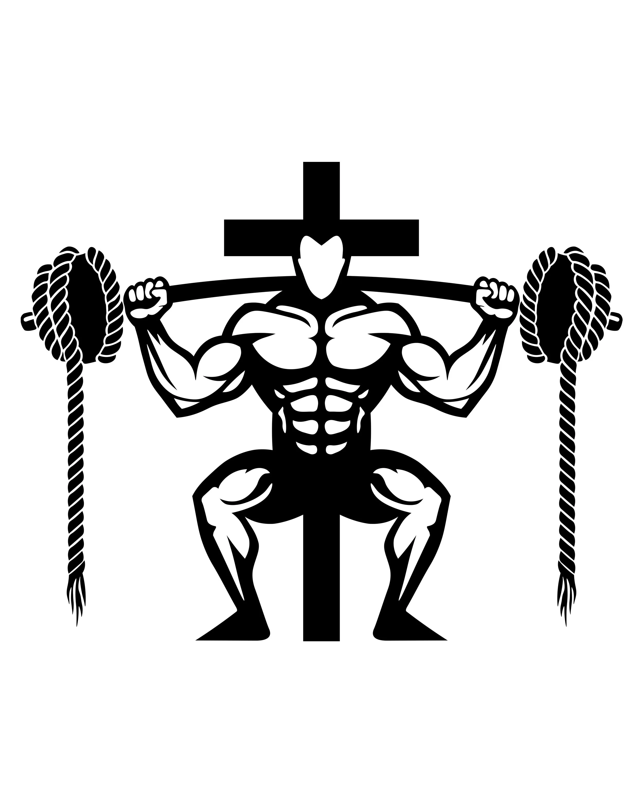
I created the entire identity from scratch in Photoshop, experimenting across multiple canvases while drafting every line using the Pen Tool. Early on, the first silhouette I designed leaned far too masculine for the unisex direction Sandra wanted, so I completely rebuilt it from the ground up. By turning the figure to face backwards, the back muscles remained powerful yet gender neutral. The process involved refining proportions, shortening the barbell ropes for a cleaner balance and ensuring perfect symmetry by building one half of the silhouette, converting it into a Smart Object and mirroring it. I also removed an experimental sword graphic I created that visually disrupted the harmony of the layout. Over 20+ hours were spent smoothing curves, perfecting shapes, and fine tuning the typography. Through consistent communication, revisions and collaboration with Sandra, the concept evolved into a clean, symbolic and purposeful final identity that represents her message with clarity and strength.
Working on Pain To Strength was much more than just a design task, it became a project rooted in meaning. Every element included in the logo had personal significance to Sandra and understanding that played a huge role in shaping the outcome. The crucifix, the water drop representing tears, the barbell and the rope symbolising both hardship and power all needed to communicate something deeper than aesthetics. My goal was to honour that symbolism while transforming her initial sketches into a polished brand identity she could proudly build her clothing line on. Seeing the final logo come together with precision and emotional weight made the entire process incredibly rewarding, and it stands as one of the most meaningful brand identities I’ve created to date.